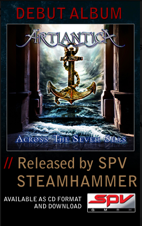
Across The Seven Seas
Artist/Band
Label
Release Date
May 21st 2013 (USA)
May 24th 2013 (Germany)
May 27th 2013 (Europe)
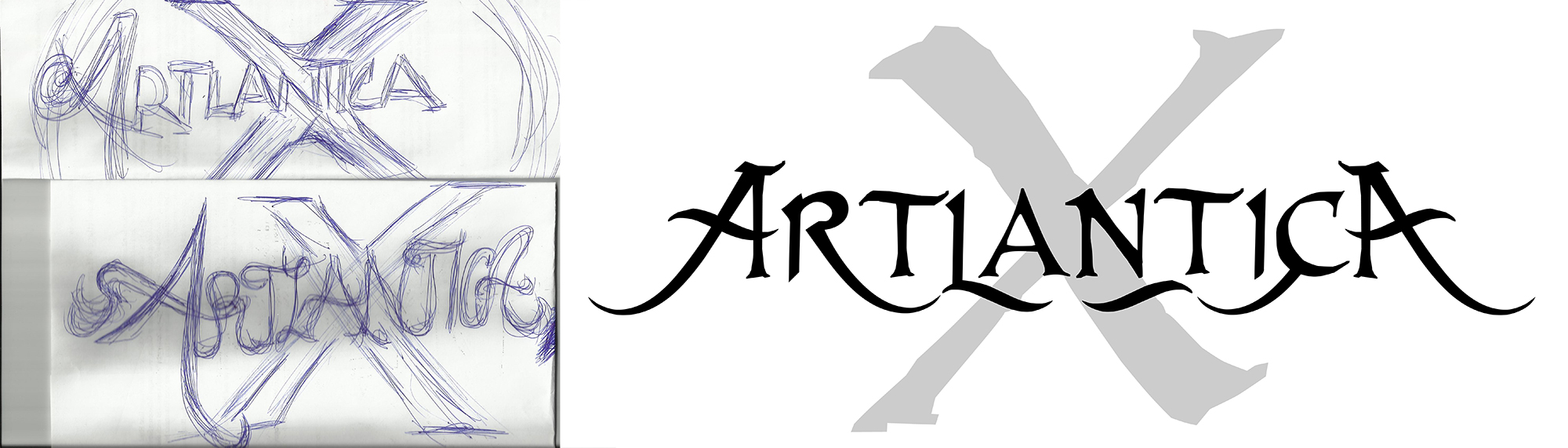
SPV introduced me to Roger Staffelbach, the virtuoso guitarist from an established band,Artension. Roger had formed a new Rock Band and they initially required a band logo 'ARTLANTICA X'. Many visuals later and various texture treaments, the logo was created. It was decided to drop the 'X' and just keep the band name as Artlantica.
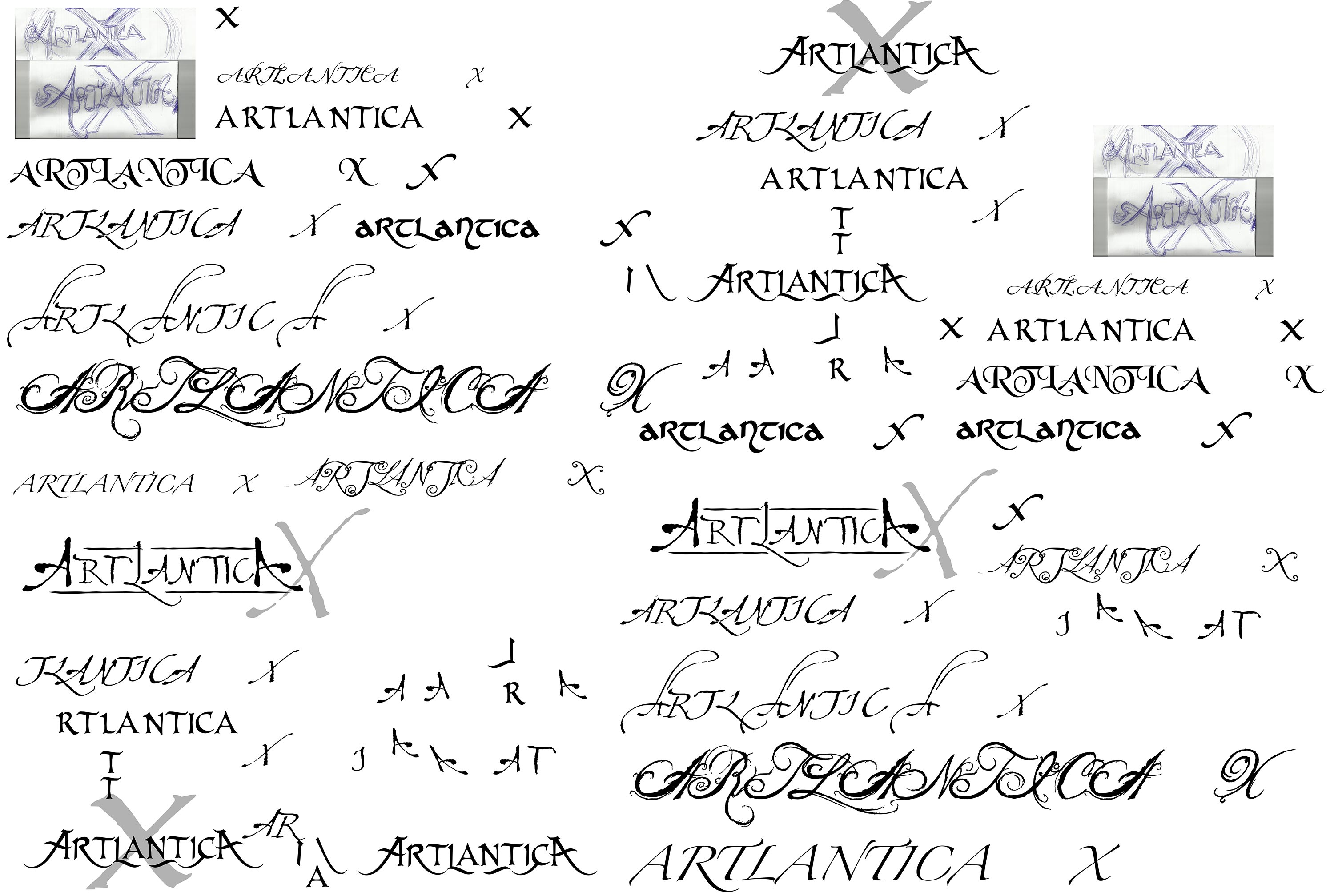
I have spent some time below, showing the process of concept/visual/thought process/design and production around the logo. It may be a small part of the album artwork but it's the bands brand. The name is important, as is the logo design and once this is cast, then texture and finish can change depending on the medium.
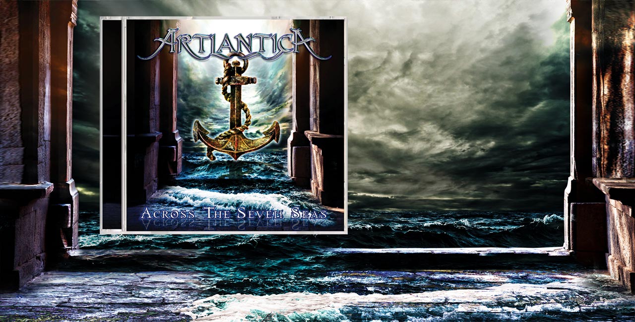
Now the logo was designed and approved, the band continued their recording of the new album which was titled, 'Across the Seven Seas'.
An album cover and packaging was now needed and Roger was impressed with the logo work and confident that we could produce something special - I am always very happy when a title throws so many ideas into a pot, so game on.
I really immersed myself into this design, having been so involved with the logo, I felt that I owned this project.
The album had a 16 page booklet, with a lot of detail and many hours of work - Its one of my favourite album designs, not just the cover but every panel, the complete package - I found that Roger was a perfectionist (as am I) and the final result shines through.
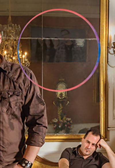
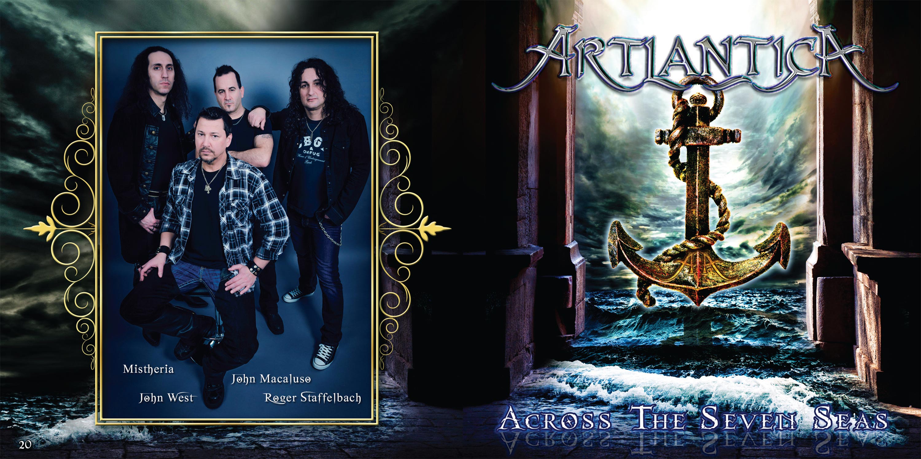
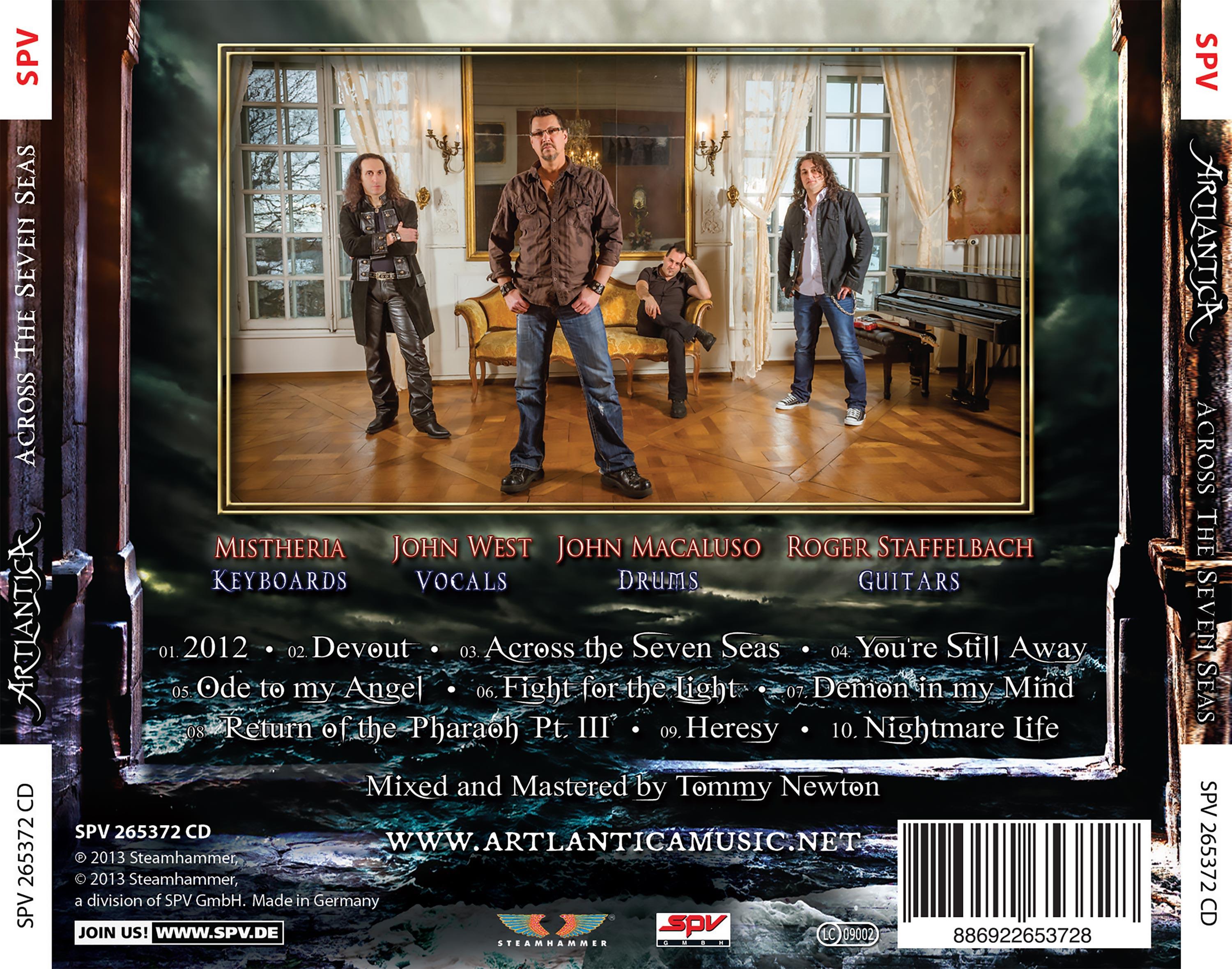
Detail example: Band Photo with another band photoplaced in the mirror reflection.
 Detail example - "A" from Artlantica carved in the stome
Logo name and sketch supplied by the band | My take on a simple back and white logo
Logo Design Process - Lots of experimentation:
Creating a textured logo in Photoshop and with an alternative design
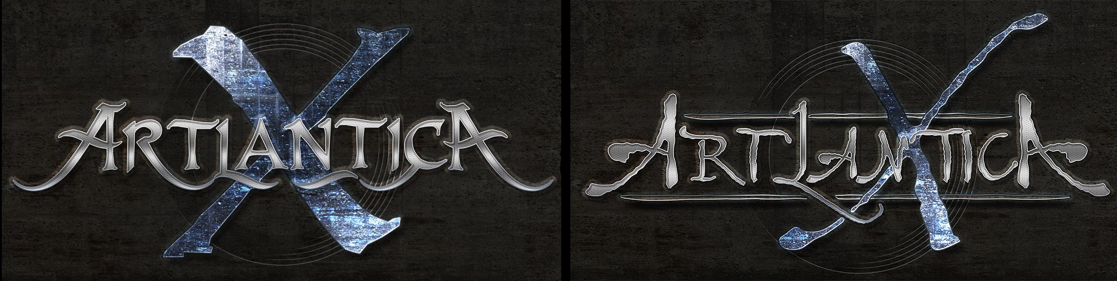
It was decided that the band wanted wanted to drop the 'X' and my design rational was presented to the band
The logo with brushed steel texture and the other with a chrome finish and album title
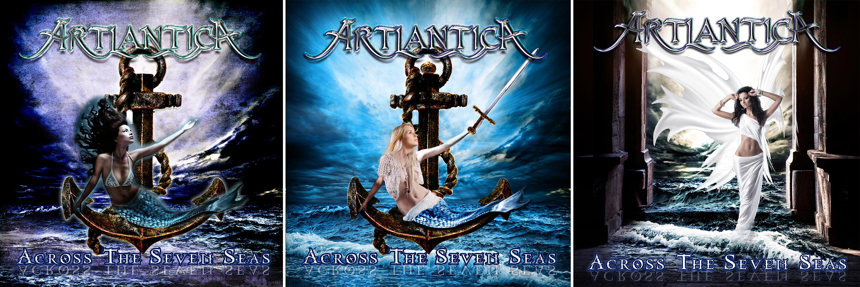
Visuals 1-3.
The band loved the Anchor and the backdrop to the third. Let's get rid of the women!
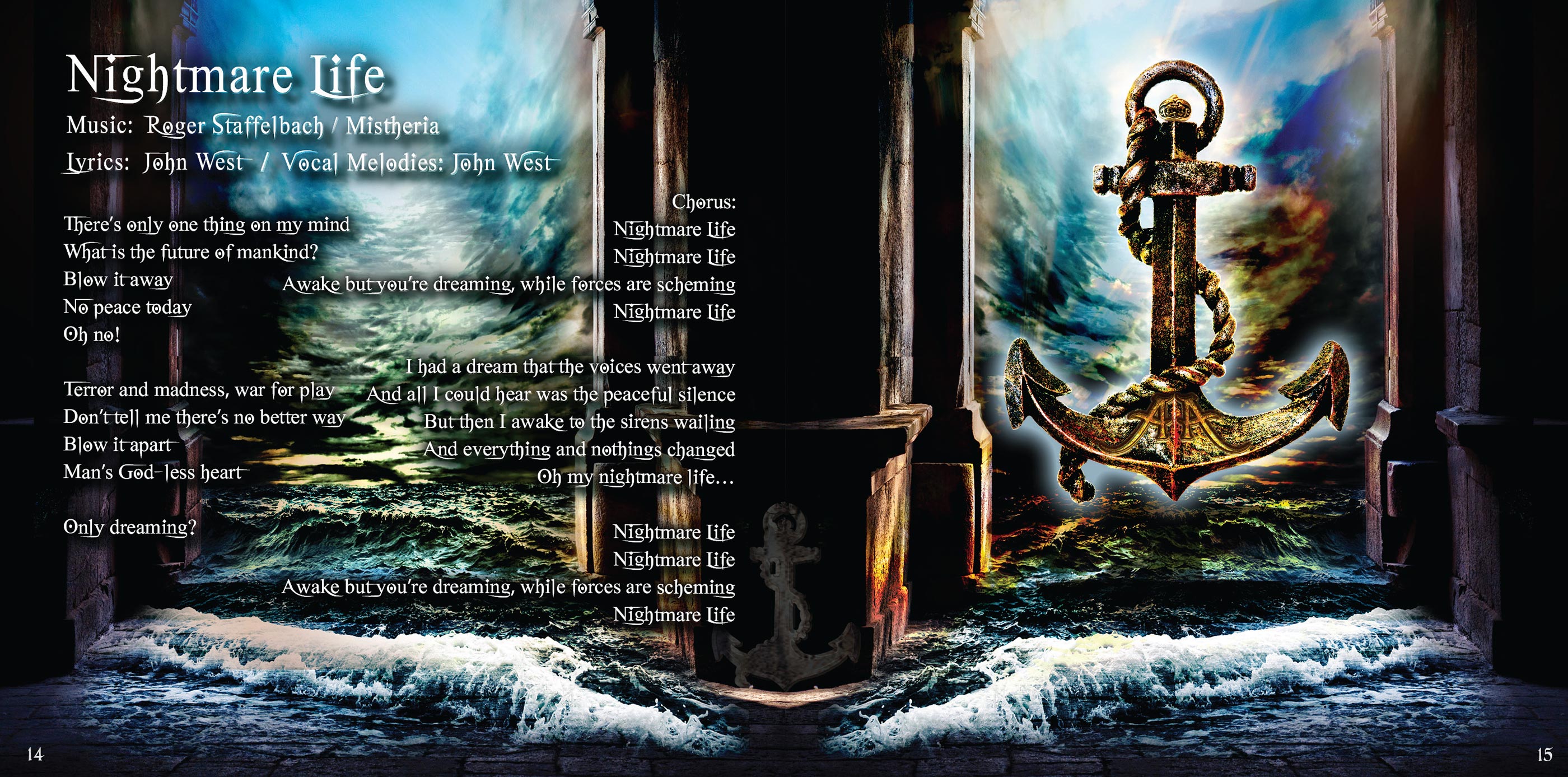
Booklet front/rear cover artwork
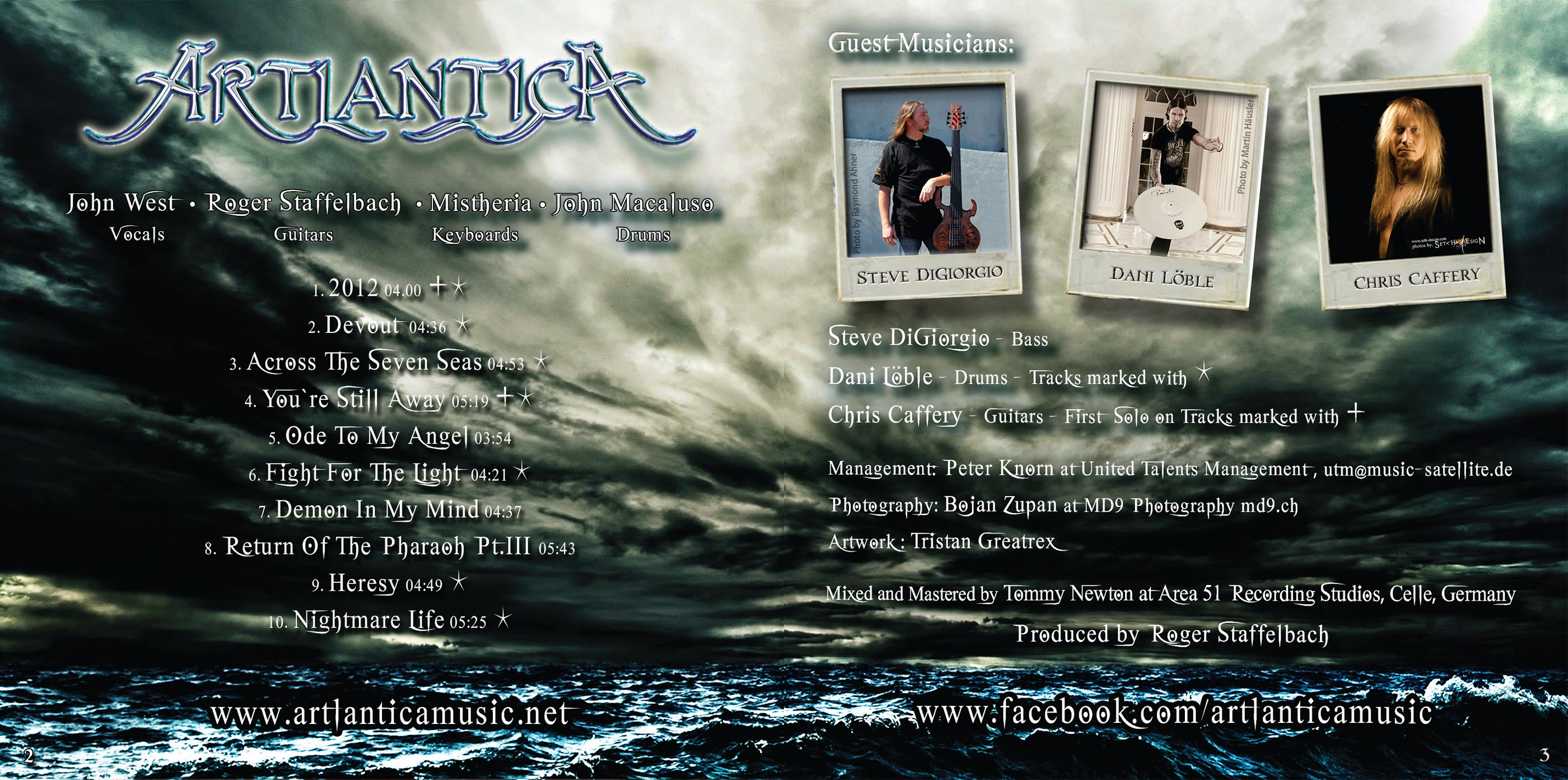
Credits
Rear Jewel Case

As always thank you for your patience and outstanding work, simply stunning. Also time and effort you put into this project! I appreciate this so much.
Roger Staffelbach, from Artlantica